Denis Mită
Senior Frontend Engineer



About

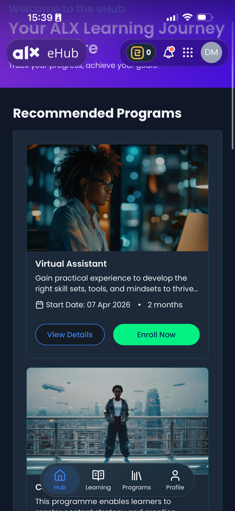
I own the primary learner dashboard (eHub), serving ~200k monthly active users within a 2.8M-user EdTech platform.
I also lead frontend development for FIT (Frontier Institute of Technology) — a US-focused university product built on the same architectural foundation.
The system spans multiple frontend surfaces inside a shared monorepo backed by a federated GraphQL backend.
- Contribute to cross-product frontend architecture
- Standardized core UI systems (modals, forms, lifecycle patterns)
- Consolidated shared logic between eHub and FIT
- Contributed to a unified cross-platform navigation SDK
- Leading a Capacitor-based mobile port with native-grade gesture routing
Recently, I've integrated AI coding agents into daily development — increasing delivery velocity while maintaining architectural consistency across surfaces.

Short-term engagement within a global AI and digital transformation consultancy.
I contributed frontend implementations across client projects, including:
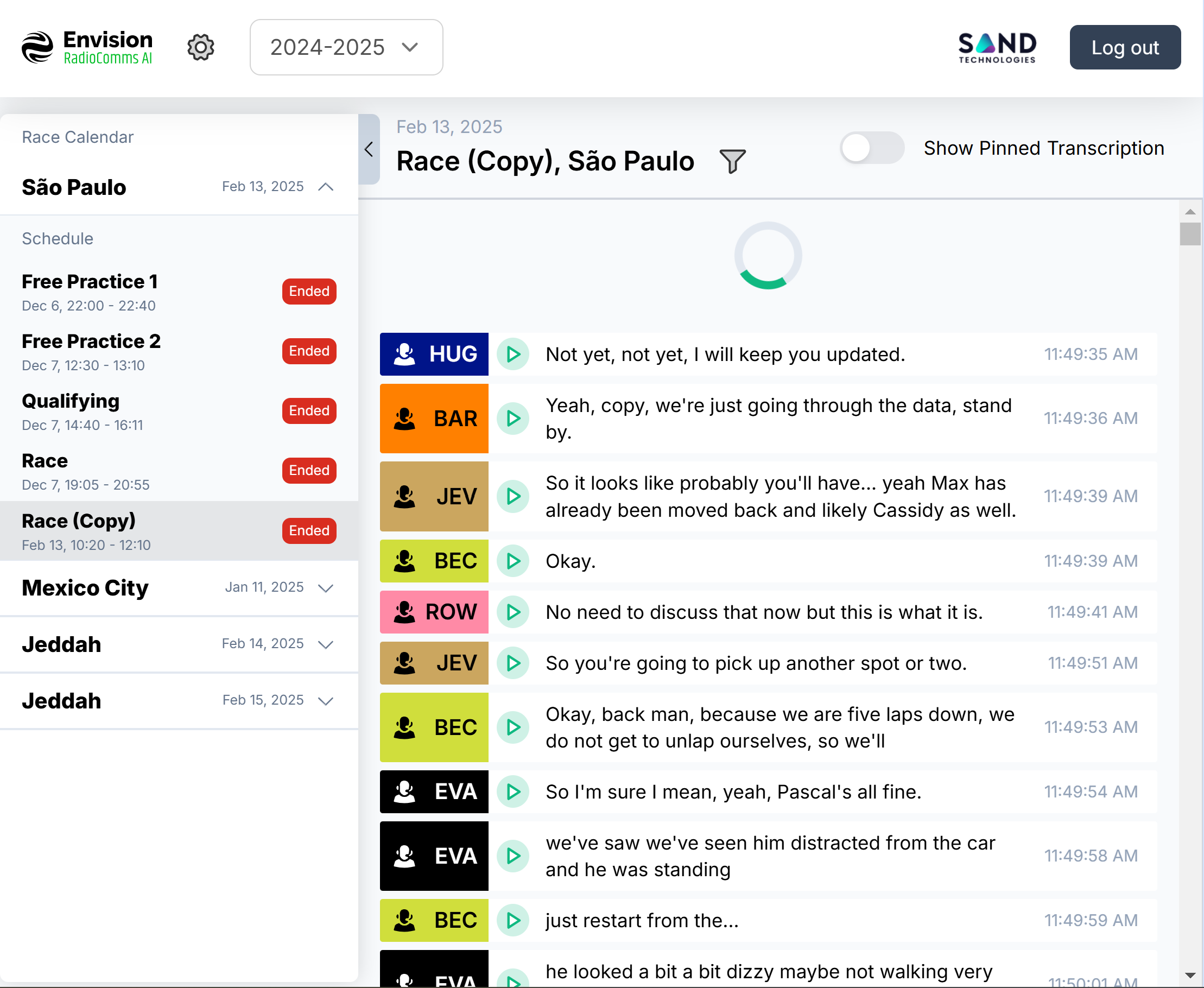
- A real-time radio monitoring web application for a Formula E team, focused on performance-aware rendering and streaming message handling.
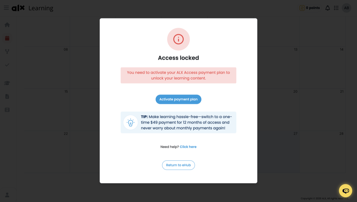
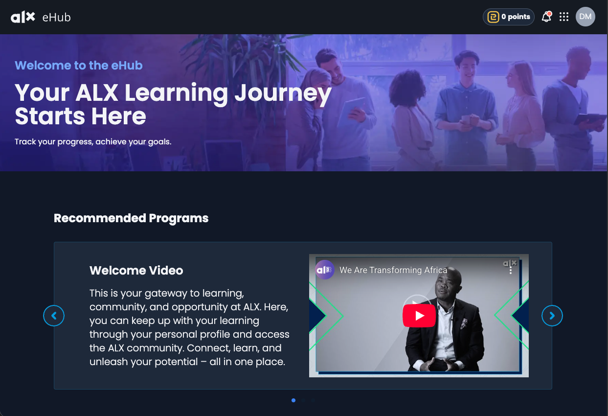
- Stabilization work on the ALX client dashboard ahead of production release.
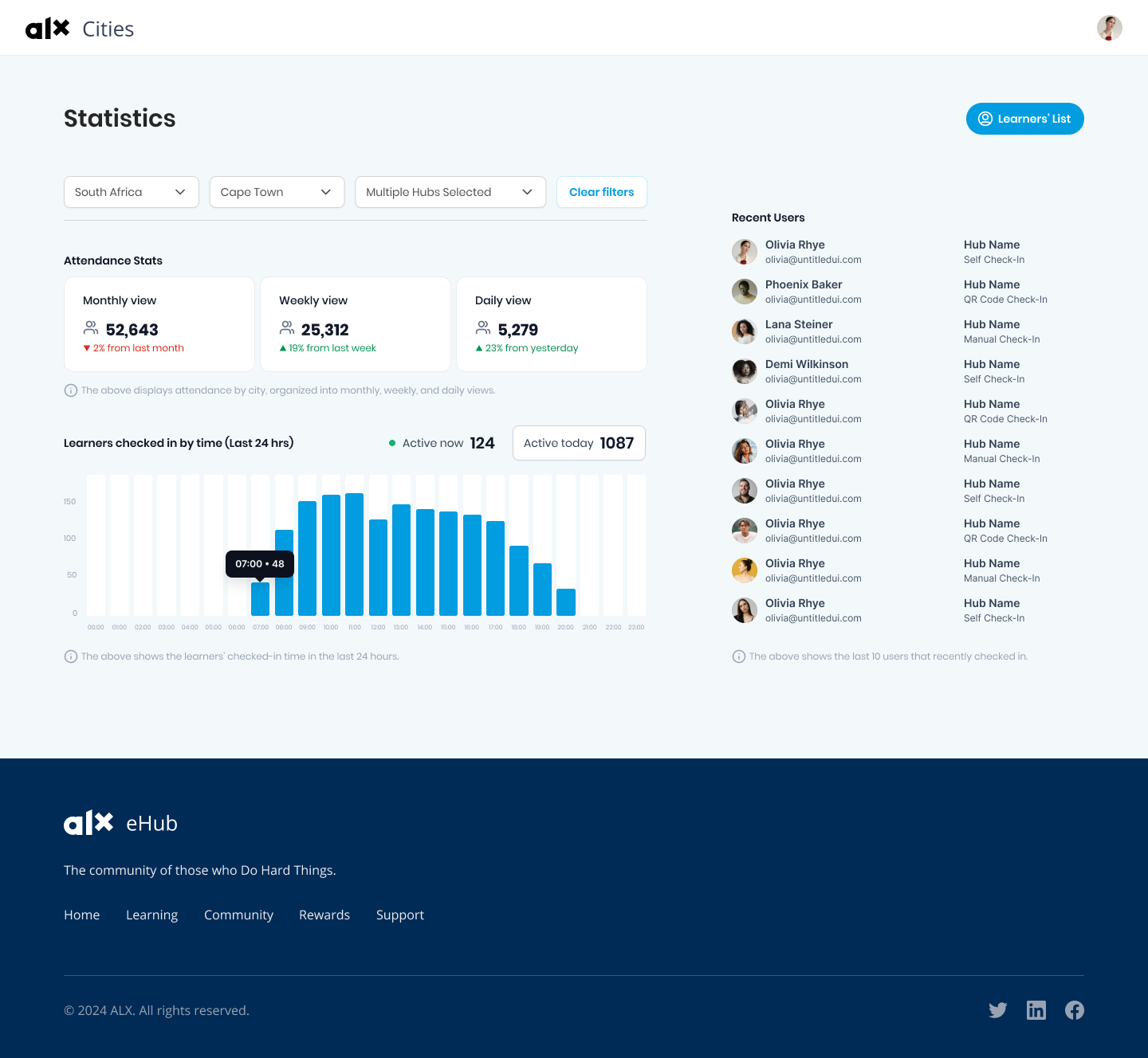
- Implemented from scratch an operational dashboard for ALX local hub teams, translating provided designs into a production-ready interface.
Focused on clean API abstraction, rapid onboarding to new codebases, and reliable delivery within consulting timelines.

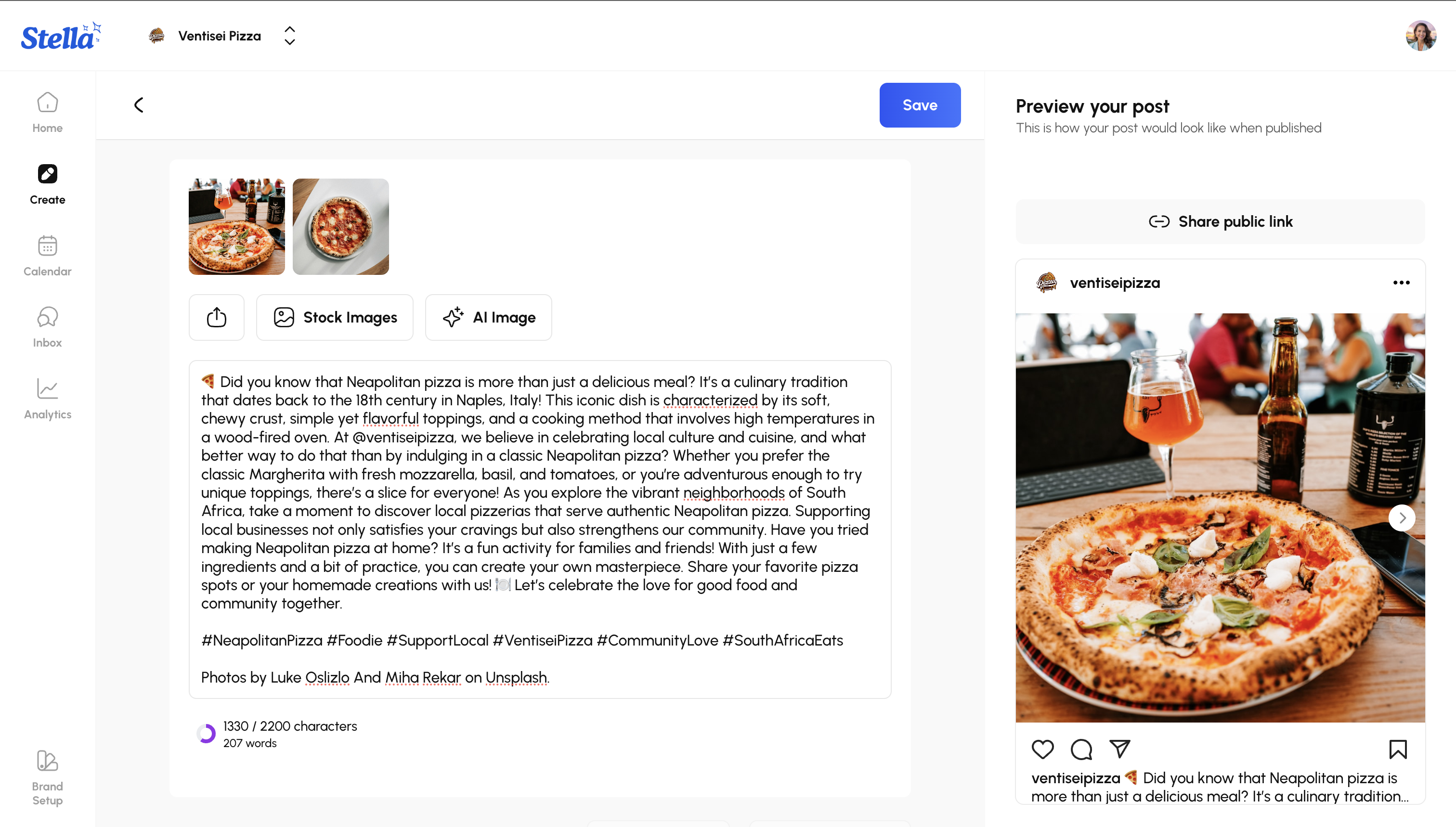
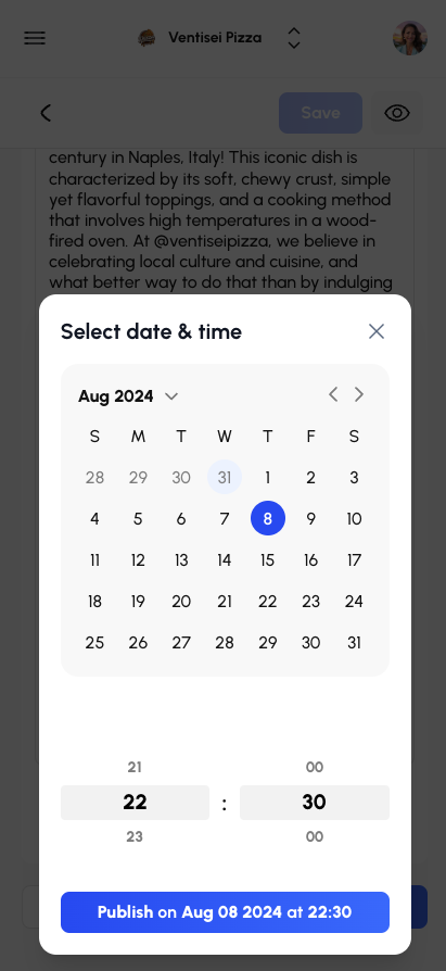
Stella was an AI-native digital marketing platform built by the team behind Try it On AI.
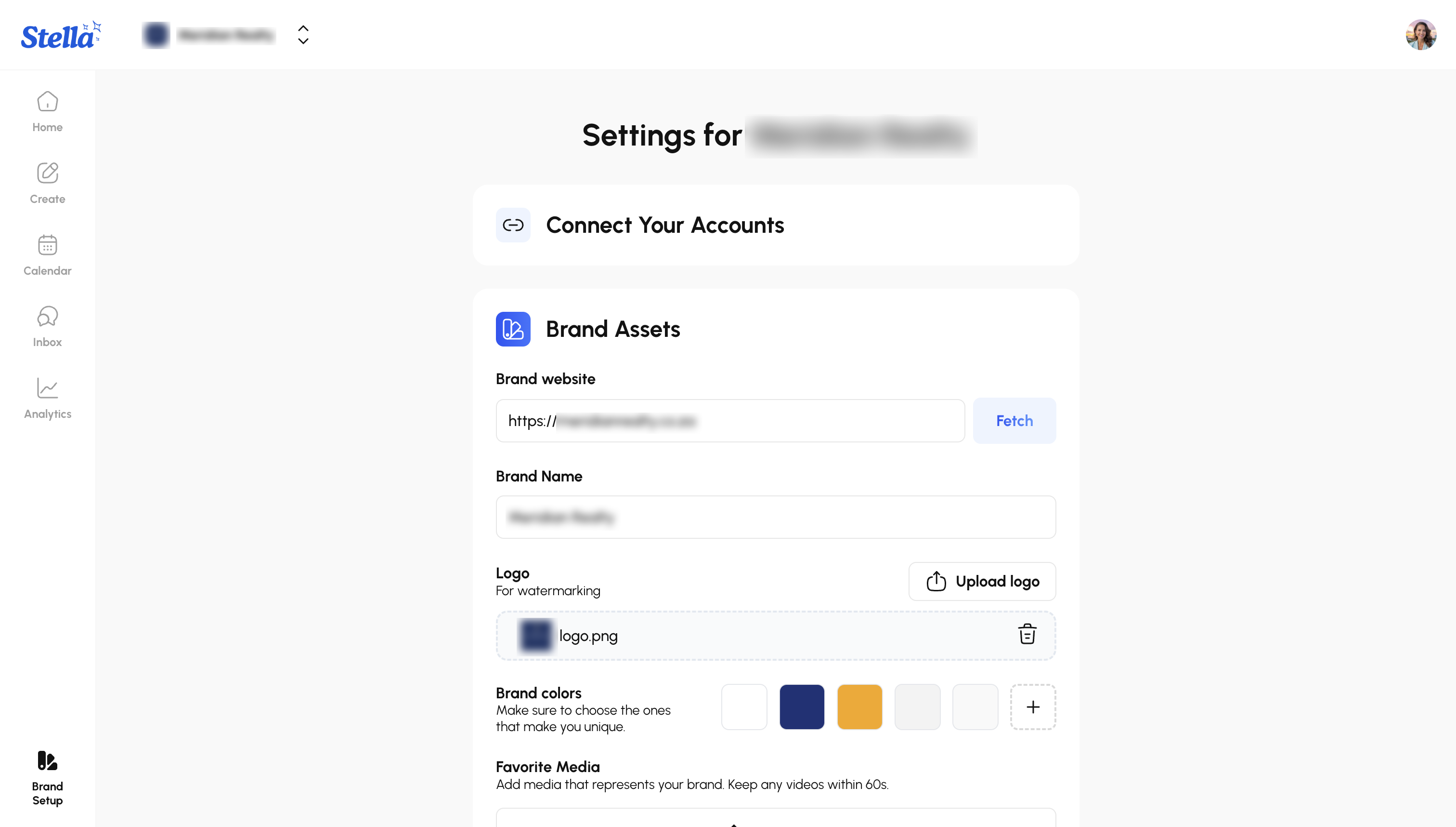
I contributed as a full-stack engineer during early product development, implementing core web application surfaces and feature flows.
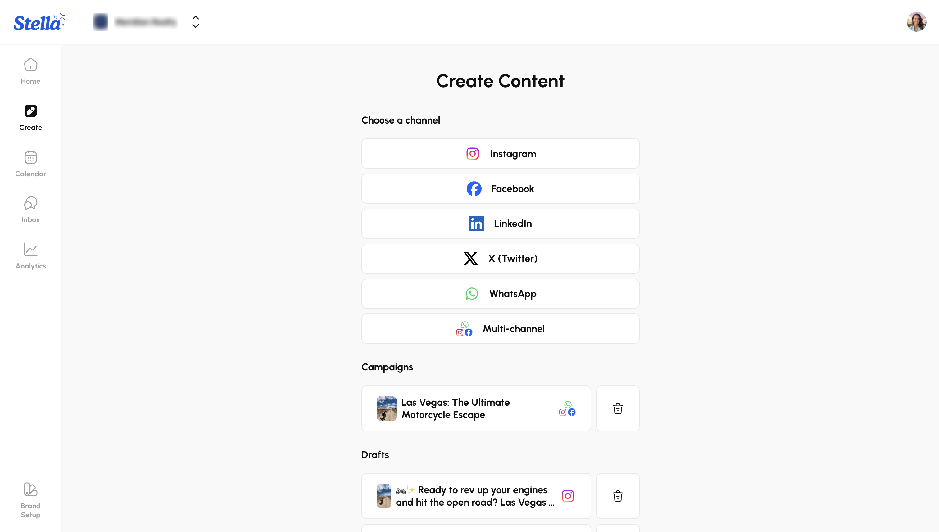
- Built a unified multi-channel social publishing interface powered by LLM integrations
- Integrated Stripe-based billing infrastructure
- Developed custom UI components and product sections across the platform
This engagement required rapid feature delivery within an evolving product environment.

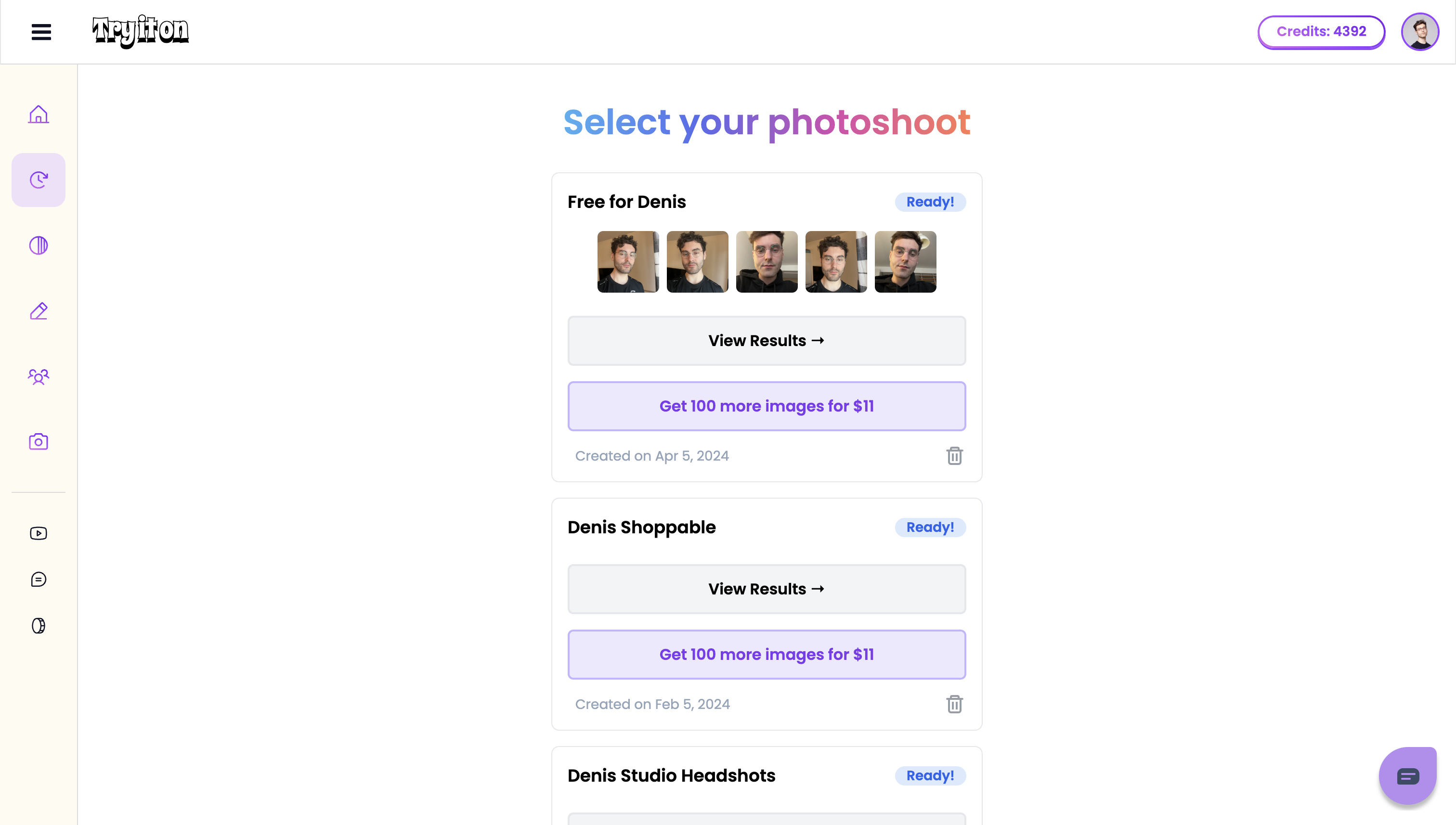
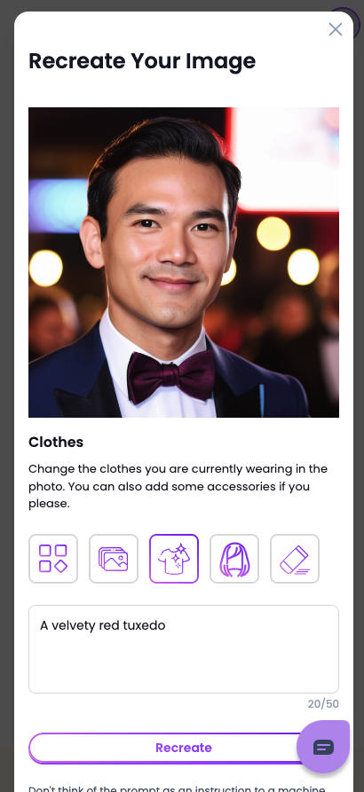
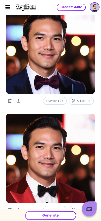
Try It On AI was an AI-native SaaS platform generating studio-quality headshots from everyday photos.
I operated as a senior full-stack engineer within a two-engineer team, working across frontend architecture and backend service layers.
- Refined and reorganized the frontend component architecture to improve maintainability and long-term clarity
- Built multiple image editing widgets from scratch, including standardized resizing pipelines and infinite-scroll lazy loading for large image sets
- Extended backend integrations, handling webhooks, batch upload flows, and model training orchestration
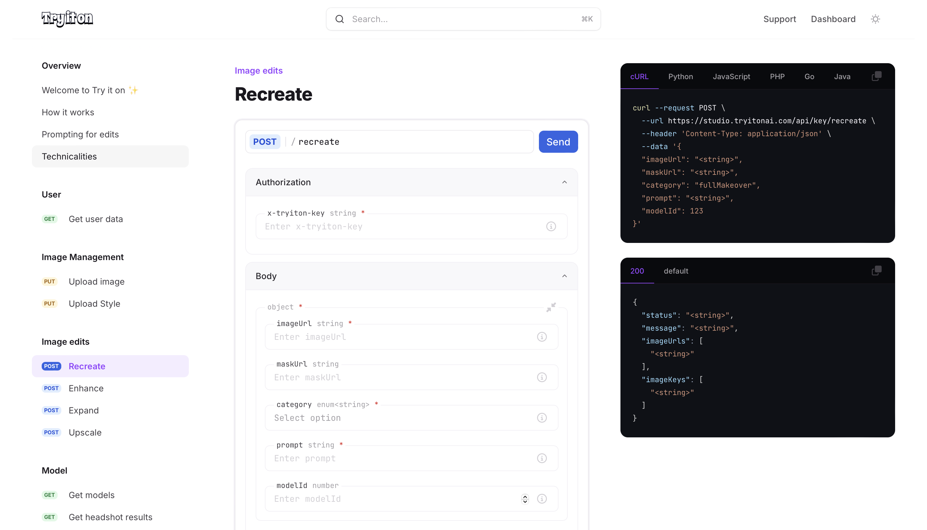
- Designed and implemented an API-key–based public API version of the product, exposing AI capabilities for external integrations
This role reflects full-stack ownership in an AI-driven product, balancing rapid feature delivery with architectural discipline.

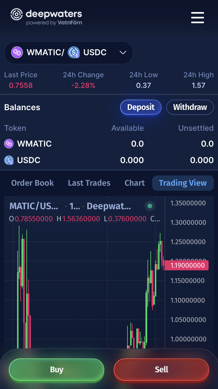
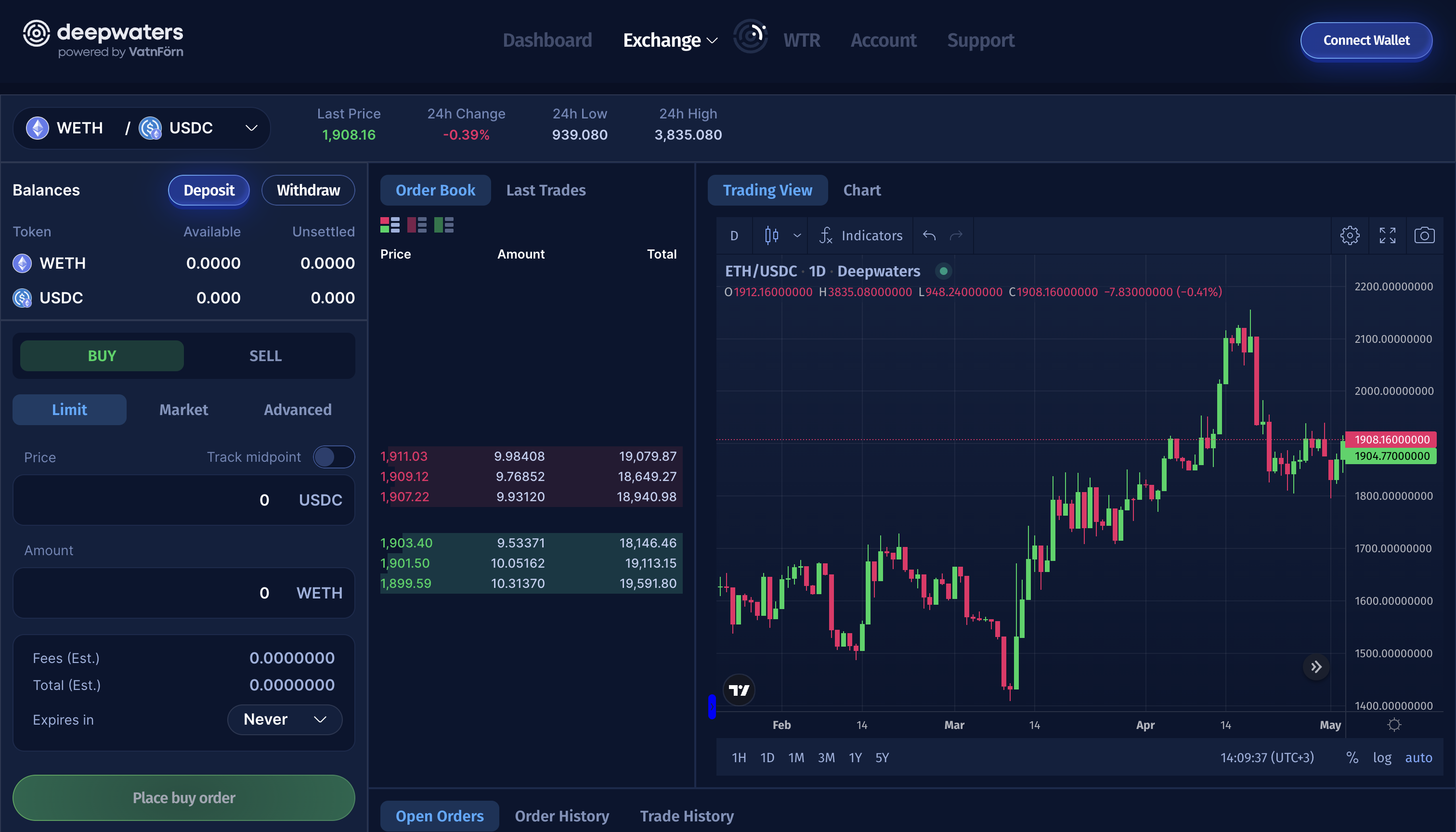
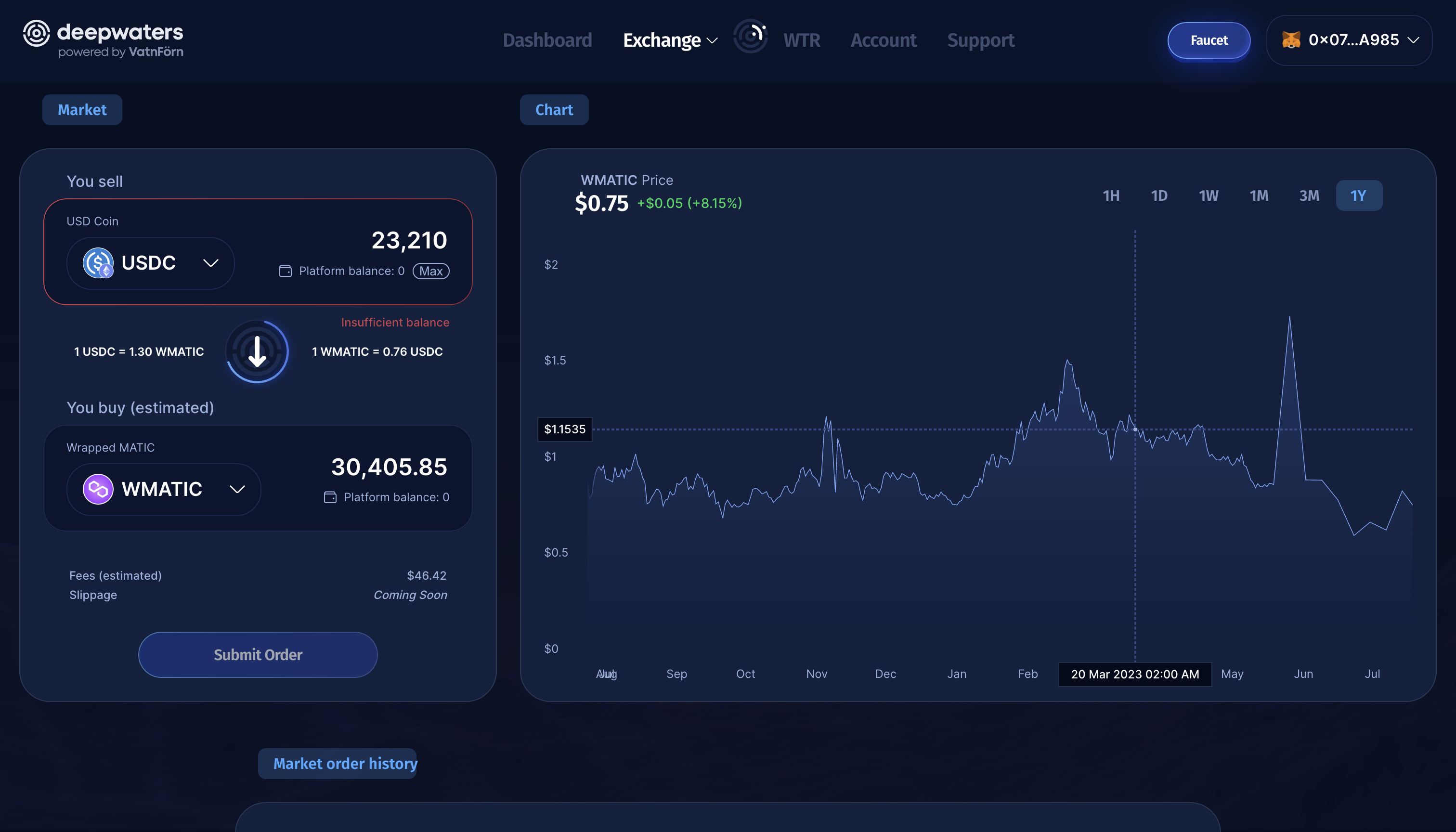
Deepwaters was an off-chain trading platform. I created and owned the frontend project from the ground up, implementing the majority of the trading interface and defining its architecture.
I structured the Next.js application, component system, and state management strategy, translating detailed product designs into a maintainable and scalable UI.
Key contributions included:
- Building all core trading widgets from scratch, including data visualizations implemented using raw SVG without external charting libraries
- Designing a deterministic smart amount input that prevented invalid states and ensured seamless formatting without UI flicker
- Delivering full mobile adaptation independently, defining responsive behavior and layout consistency without dedicated mobile design files
- Maintaining the marketing site alongside the core trading dashboard
This role demonstrates full frontend ownership, clean system design, and disciplined 0→1 execution within a well-defined product environment.


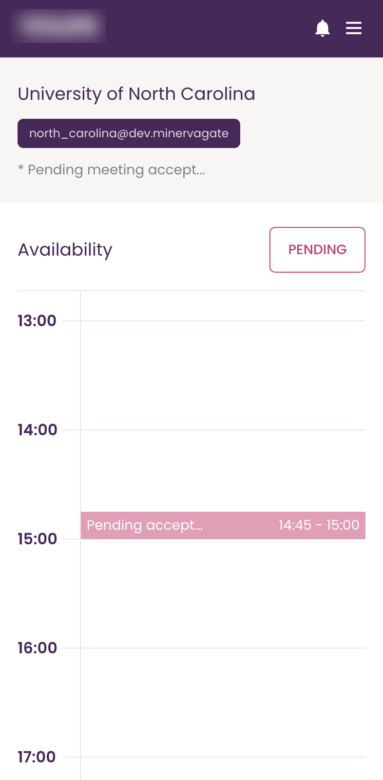
At Minerva Gate, I operated as a technical lead within a small product-focused consultancy, delivering client-facing web applications across multiple industries.
- Led frontend architecture and implementation across concurrent client projects
- Defined project structure and technical direction within a lean team environment
- Drove technical alignment between business stakeholders and engineering execution
- Mentored junior developers and enforced quality standards across deliveries
This role sharpened my ability to make architectural decisions under ambiguity, balance client expectations, and ship reliably within tight delivery timelines.

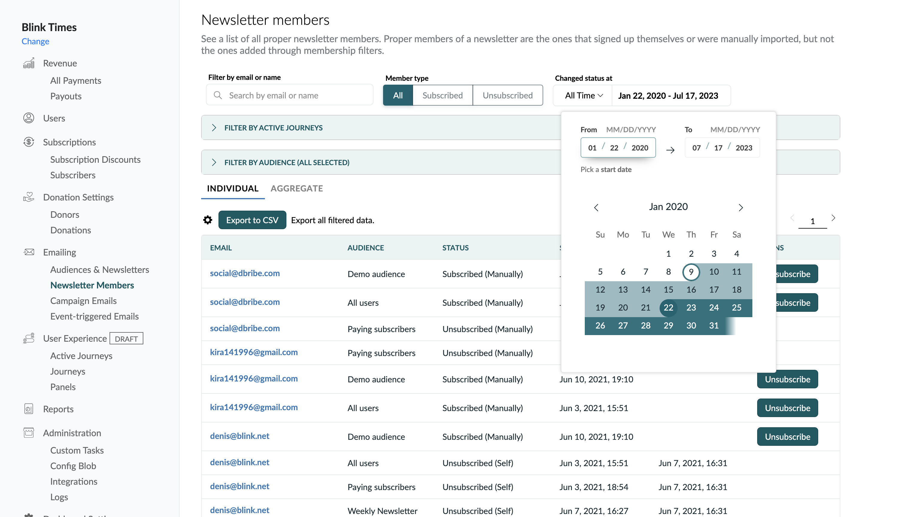
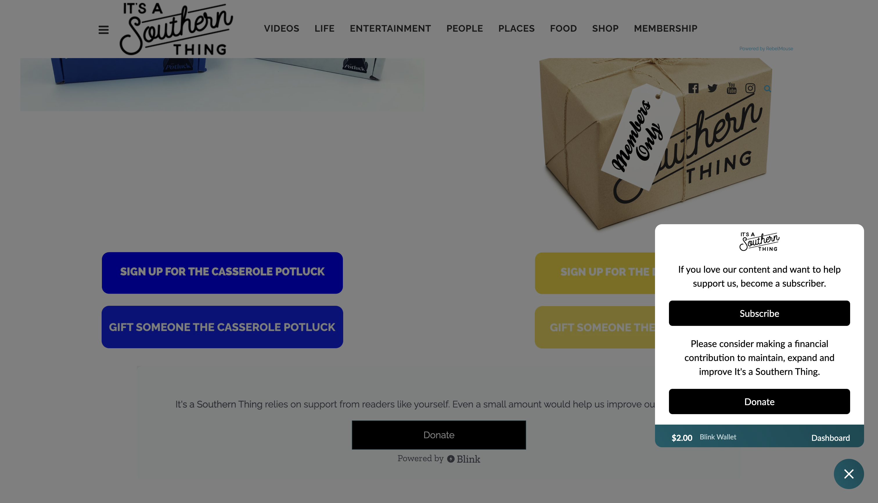
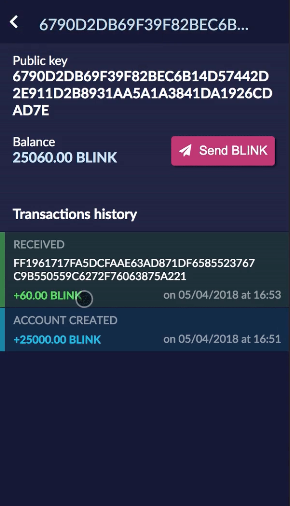
Blink evolved from a high-performance distributed ledger protocol into an embedded identity and payments platform integrated directly into publisher websites (~20 publishers, ~500k users), processing real monetary transactions in production.
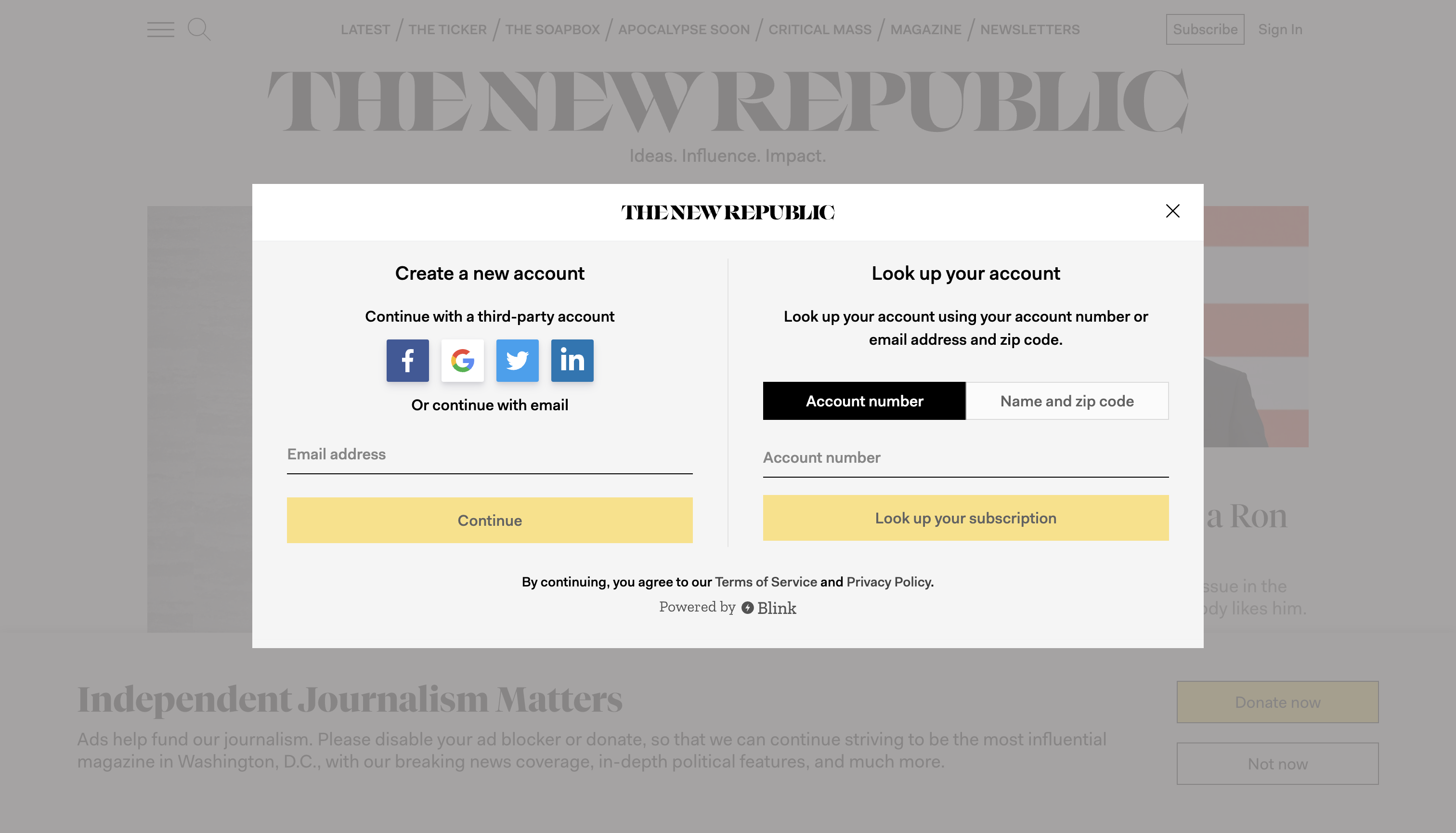
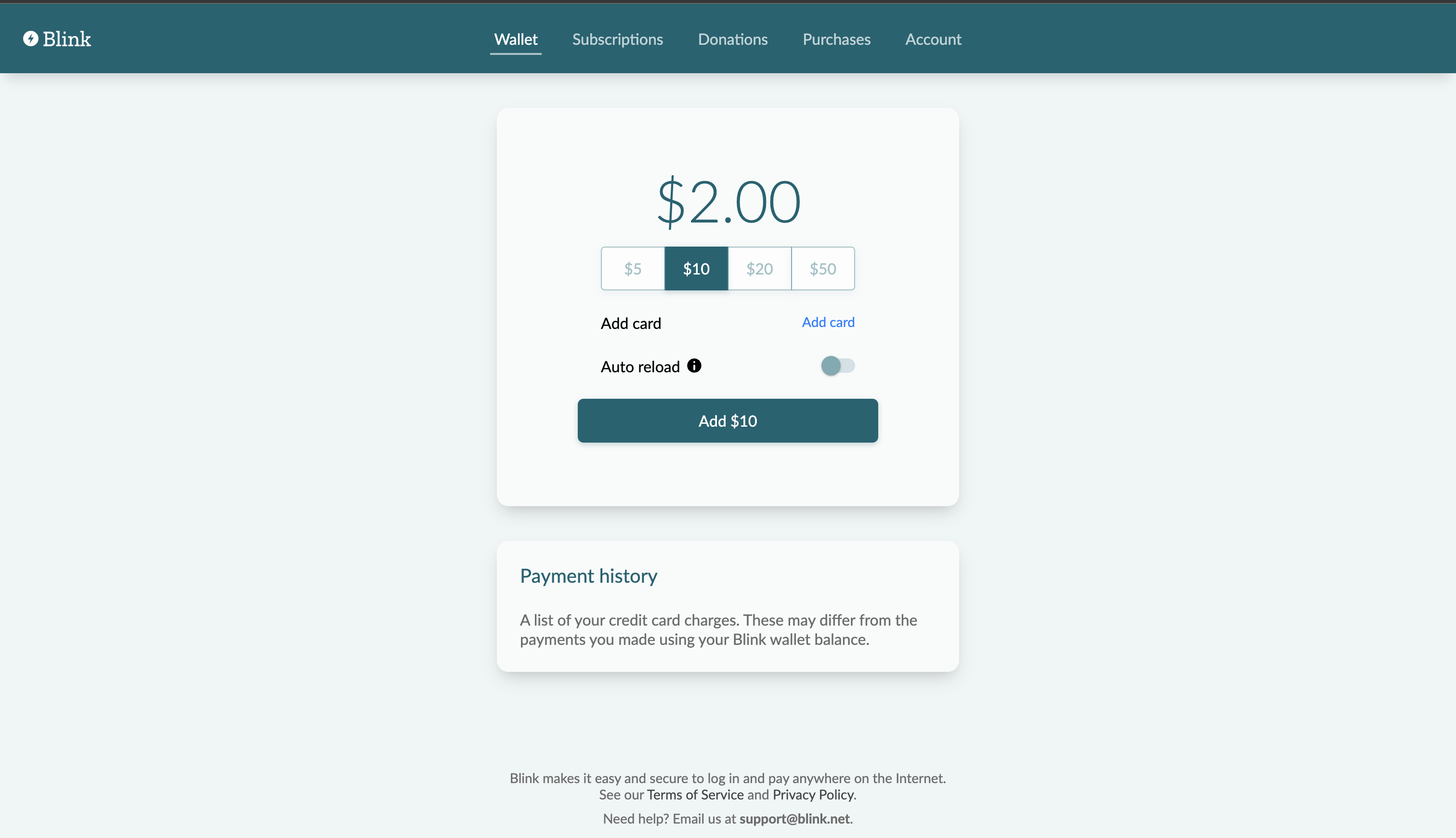
As the founding frontend engineer, I architected and implemented the entire web surface: user dashboards, publisher tooling, admin systems, and the externally distributed JavaScript SDK injected into third-party sites.
The SDK orchestrated complex iframe lifecycles, secure cross-domain postMessage communication, domain verification, configuration-based feature toggling, and backward-compatible versioning across publishers with different paywalls, theming systems, and monetization flows.
A core architectural challenge was building a full-screen, transparent, non-blocking overlay iframe that dynamically transformed into animated multi-step flows. This required custom routing overrides, dual-rendering for transition measurement, and solving browser-level edge cases including Safari storage isolation, Facebook in-app OAuth constraints, Chrome iframe animation bugs, and mobile interaction inconsistencies.
I evolved the system from route-driven navigation into a state-driven flow engine, enabling flexible entry points (SDK triggers, UI buttons, or programmatic calls) while preserving deterministic UI behavior across embedded contexts.
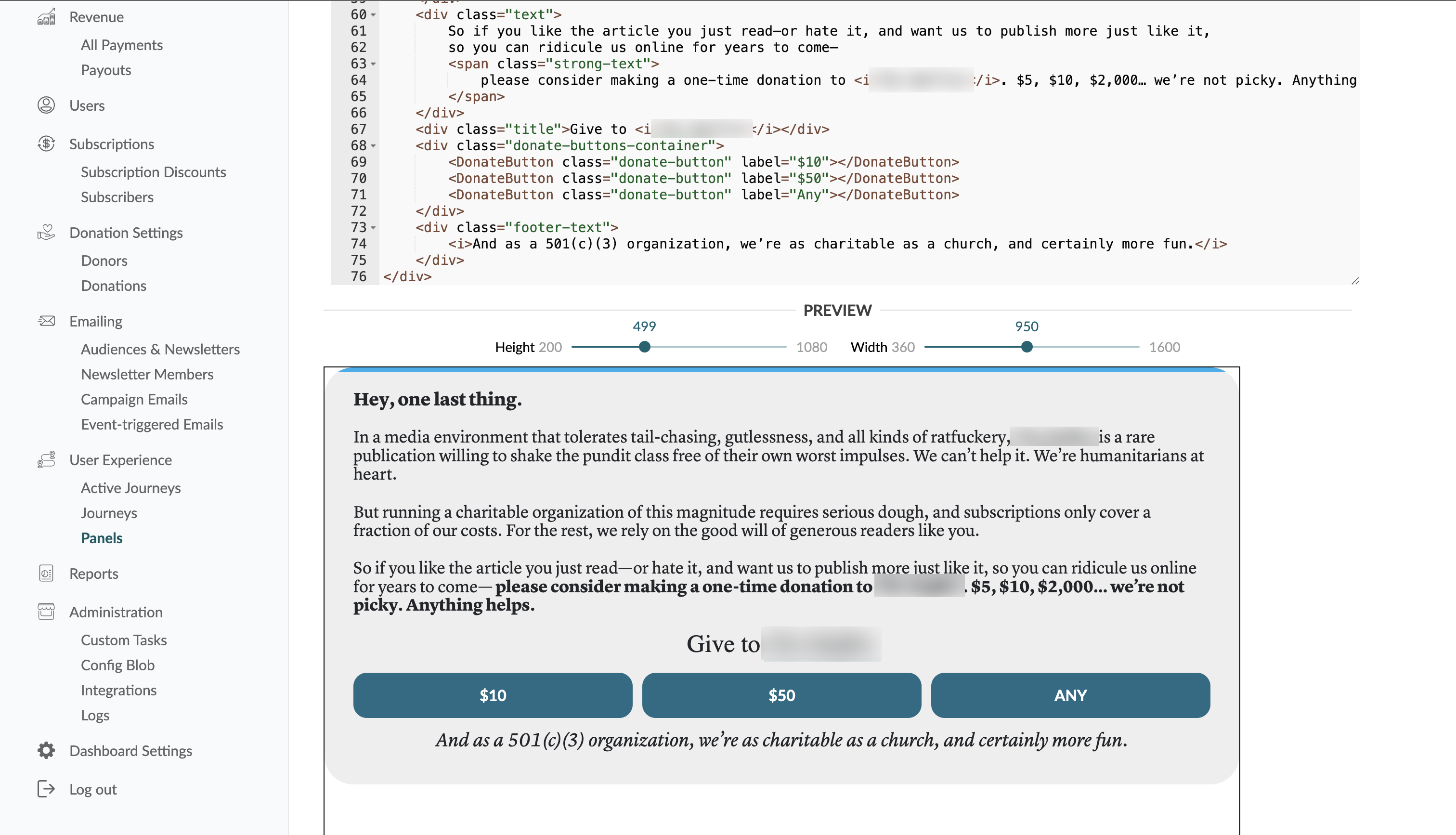
Publisher-facing tooling included configurable monetization journeys, A/B testing capabilities, and dynamic templating systems allowing HTML/CSS-level customization inside controlled embedded environments.
Blink integrated Stripe-based payments, raised funding during its protocol phase, and remains operational on publications like The New Republic and It's a Southern Thing.

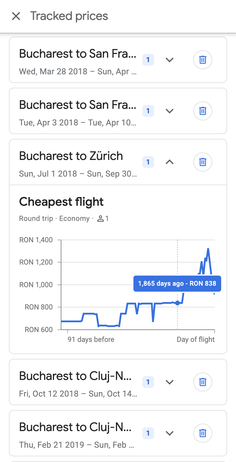
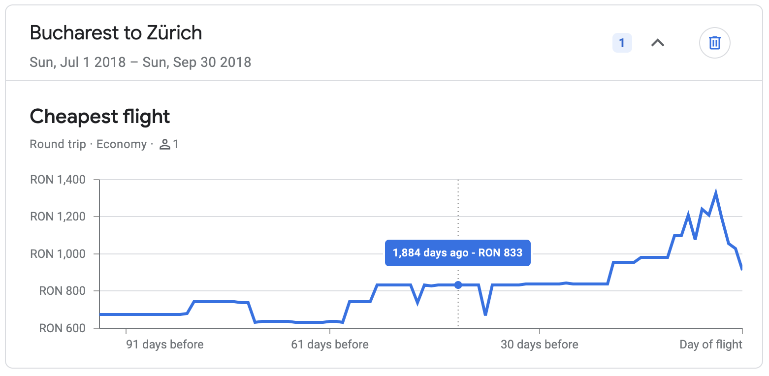
Two frontend-focused internships at Google: first within Google Cloud (Warsaw), later on Google Flights (Zurich).
- Built an internal Chrome extension for Google Cloud, enabling stats monitoring, quick actions, and structured web inspection workflows
- Contributed UI features to the Kubernetes frontend (Angular)
- Implemented the historical price tracking chart in Google Flights, adapting Google Charts to match production design constraints
Worked within high-process, large-scale environments where correctness, edge-case handling (including RTL support), and consistency across international markets were critical.

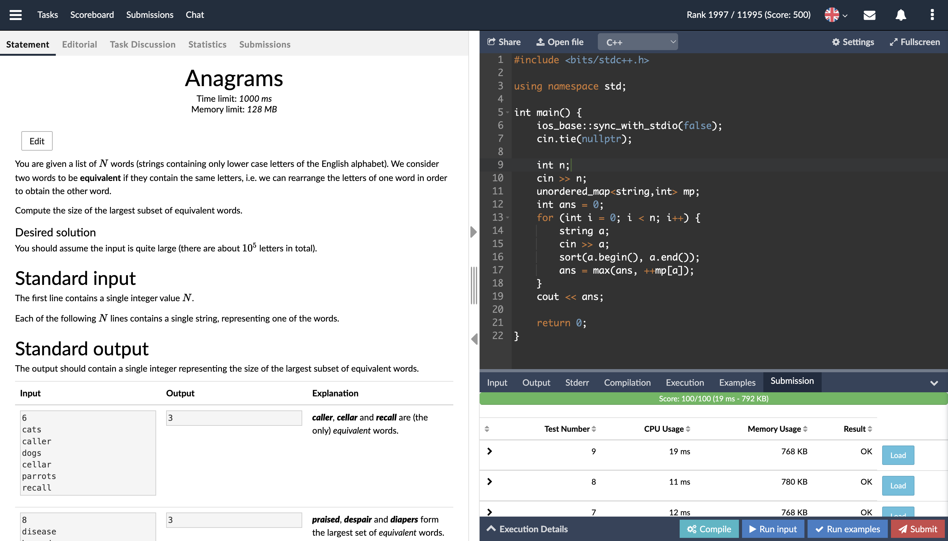
CS Academy was a competitive programming platform built from scratch by a small team of engineers. The platform remains active today and has been used for national olympiad training camps and IEEE-hosted contests.
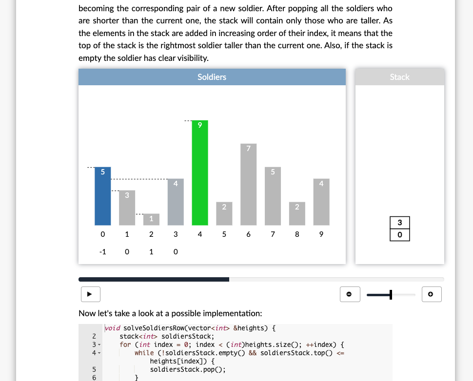
I joined as an early engineer and contributed across frontend systems, interactive tooling, and internal framework development.
- Built a browser-based multi-language code editor (Ace) with inline compilation feedback and structured error parsing
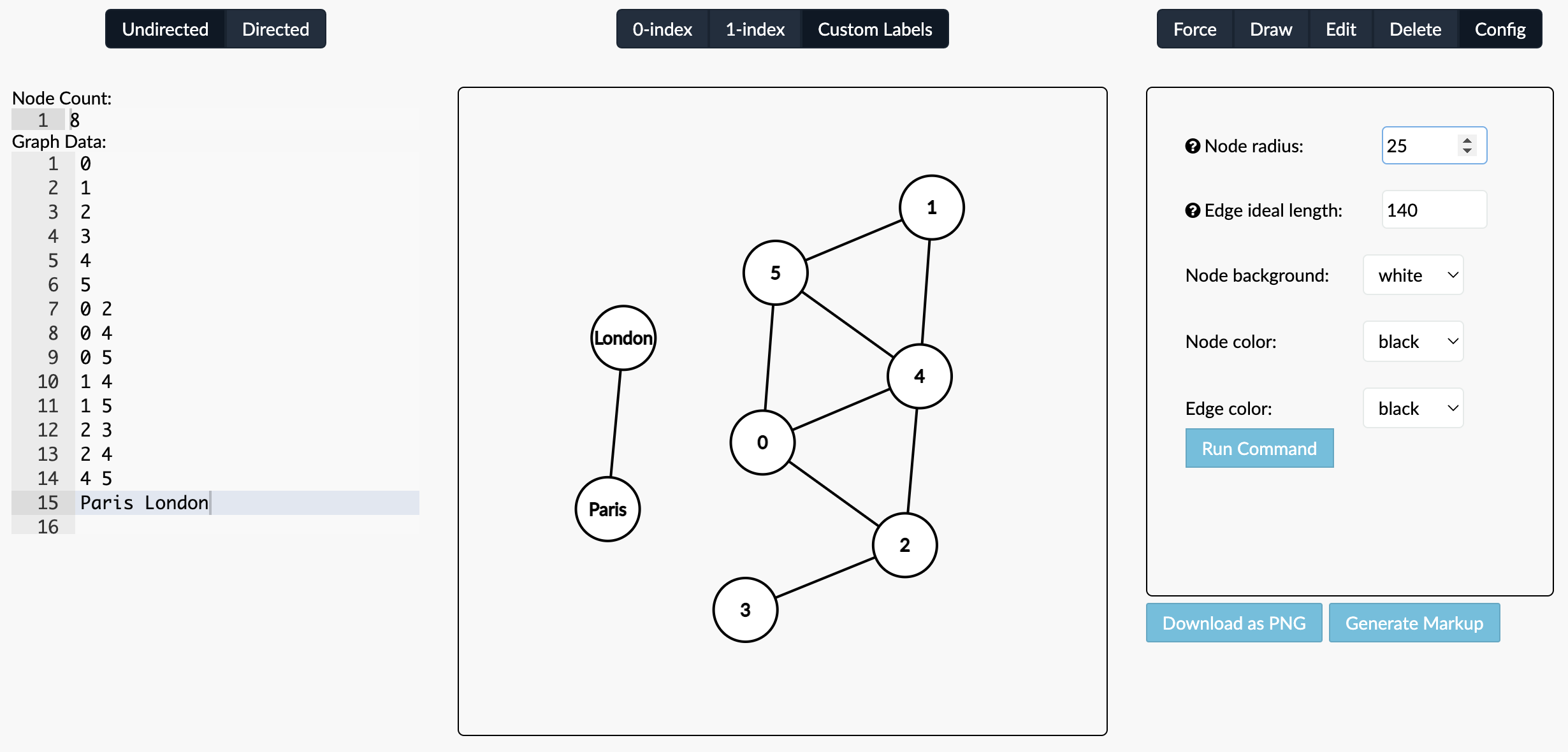
- Developed an interactive graph editor, initially using D3 and later rewritten for full rendering control
- Implemented an O(N·D) diffing algorithm and visualized differences using custom SVG gutter connections
- Contributed to Stem.js (a custom JSX framework), building foundational UI primitives
With a competitive programming background (Balkan Olympiad in Informatics silver medal), I applied rigorous algorithmic thinking to frontend tooling and UI systems — building deterministic, performance-aware interfaces from first principles.
